Lycogel
Rejuvenating an international skincare brand identity.
Back in 2018, after working with our Dutch friends Lycogel for some time, we were approached to give the company a complete face-lift (no pun intended). Seven years later, we revisit the project and see if the brand identity has stood the test of time.
How Lycogel influenced a new era of skincare
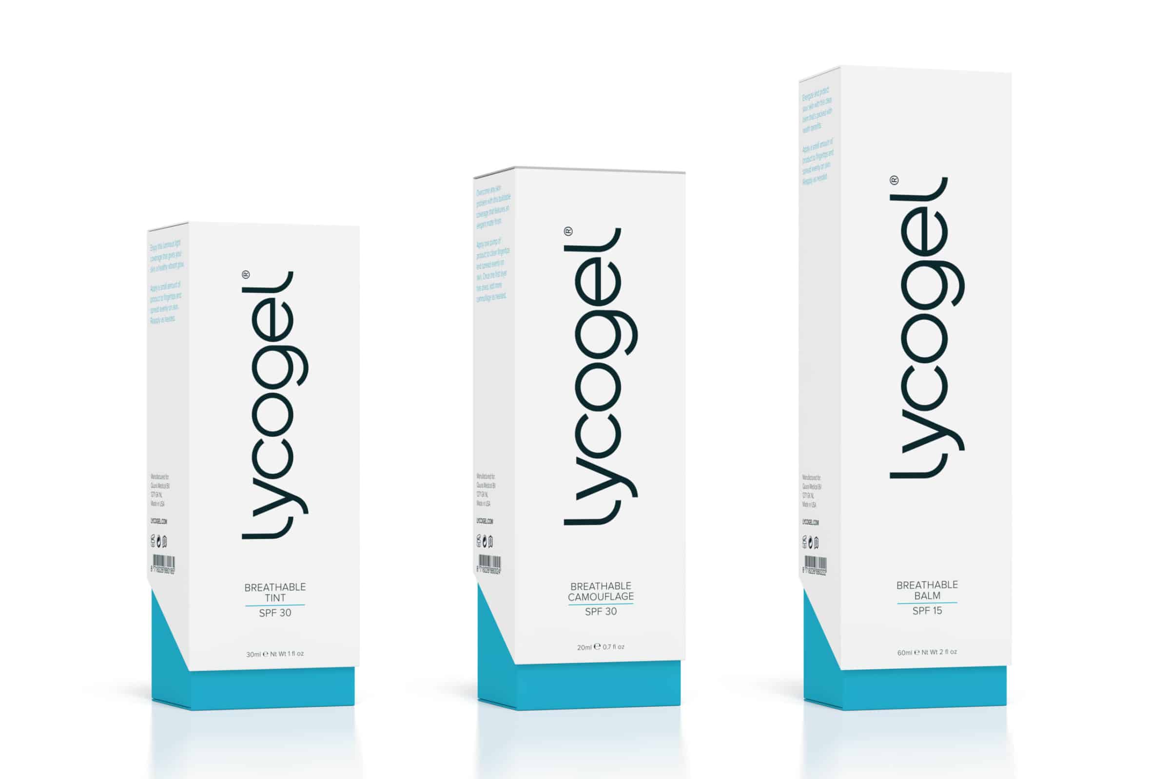
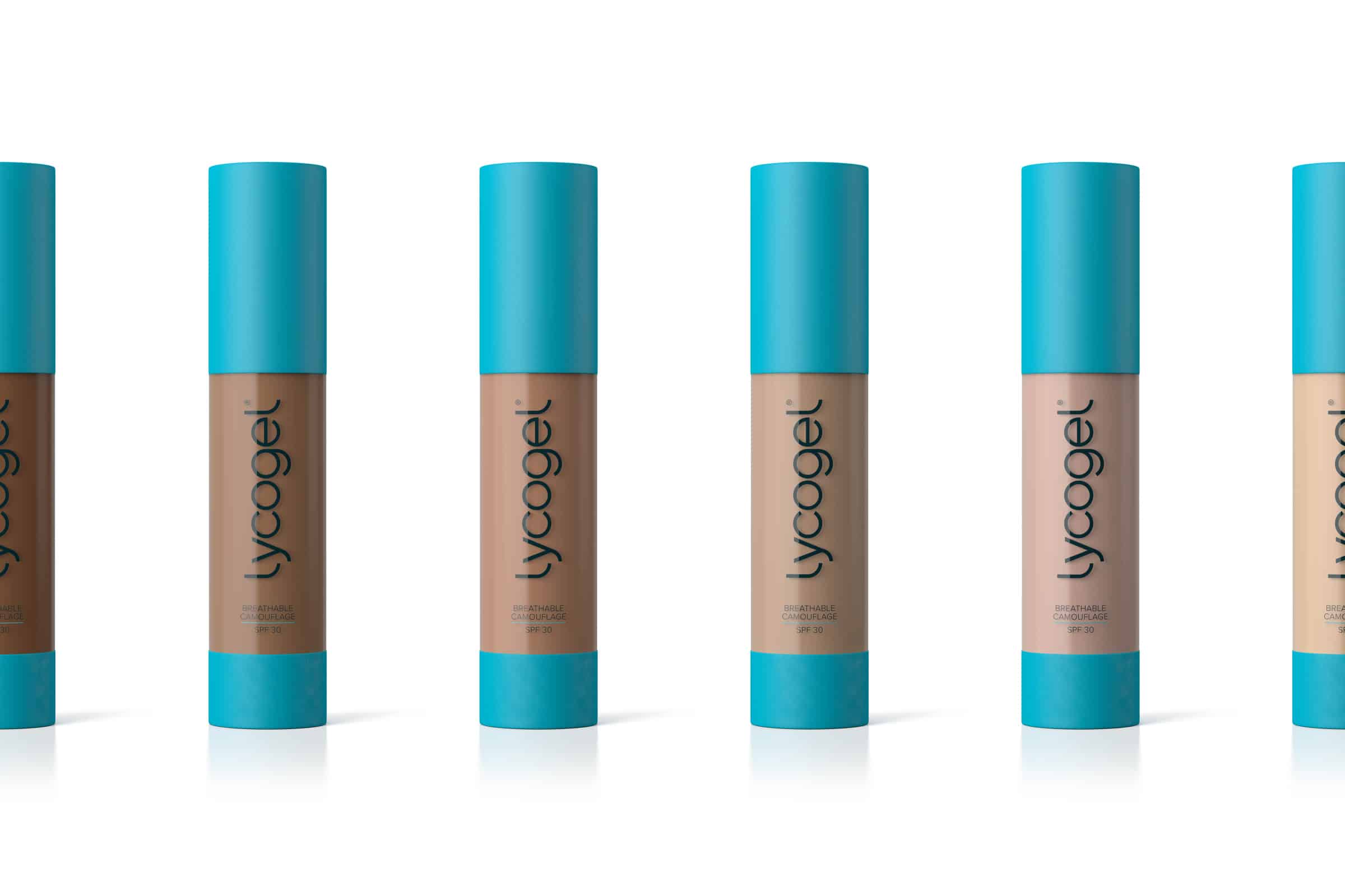
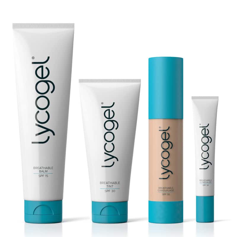
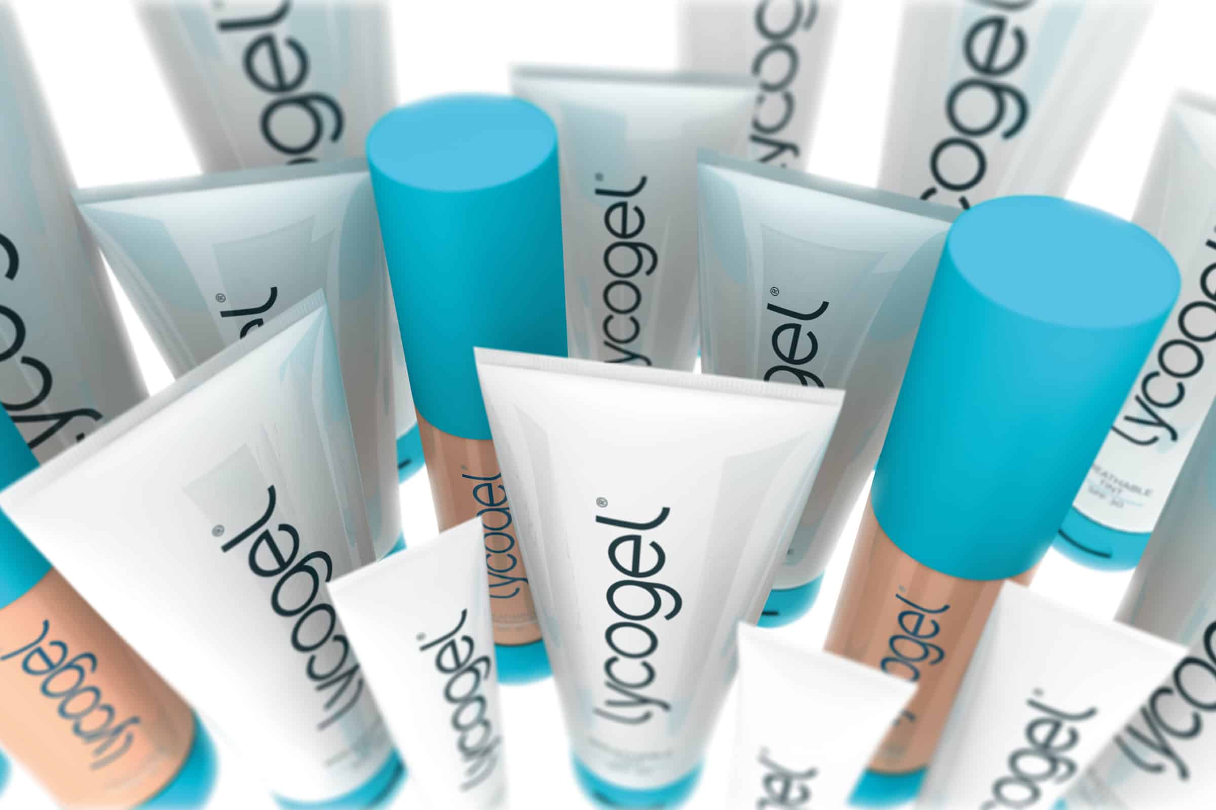
Originally used as a post-procedure foundation to help cosmetic surgery patients hide the signs of their procedure; Lycogel soon achieved international recognition as a benchmark skincare brand. Its everyday breathable camouflage and concealer, was in high demand, with rivals trying to copy its formula.
To keep up with an ever-expanding and demanding market, the company soon realised a brand refresh was inevitable, and approached us to give it a makeover (pun intended).
Logo design; embracing the contours of type
There’s a certain level of irony, when tasked to create a timeless logo for an age-defying cosmetic product. To an extent, all logo design should be timeless; even those which purposefully convey a sense of nostalgia, or jump on a bandwagon.
Visually, over-engineered brands tend to date faster than more modest, unassuming designs. Therefore, simplicity is a key ingredient to making a piece of timeless design.
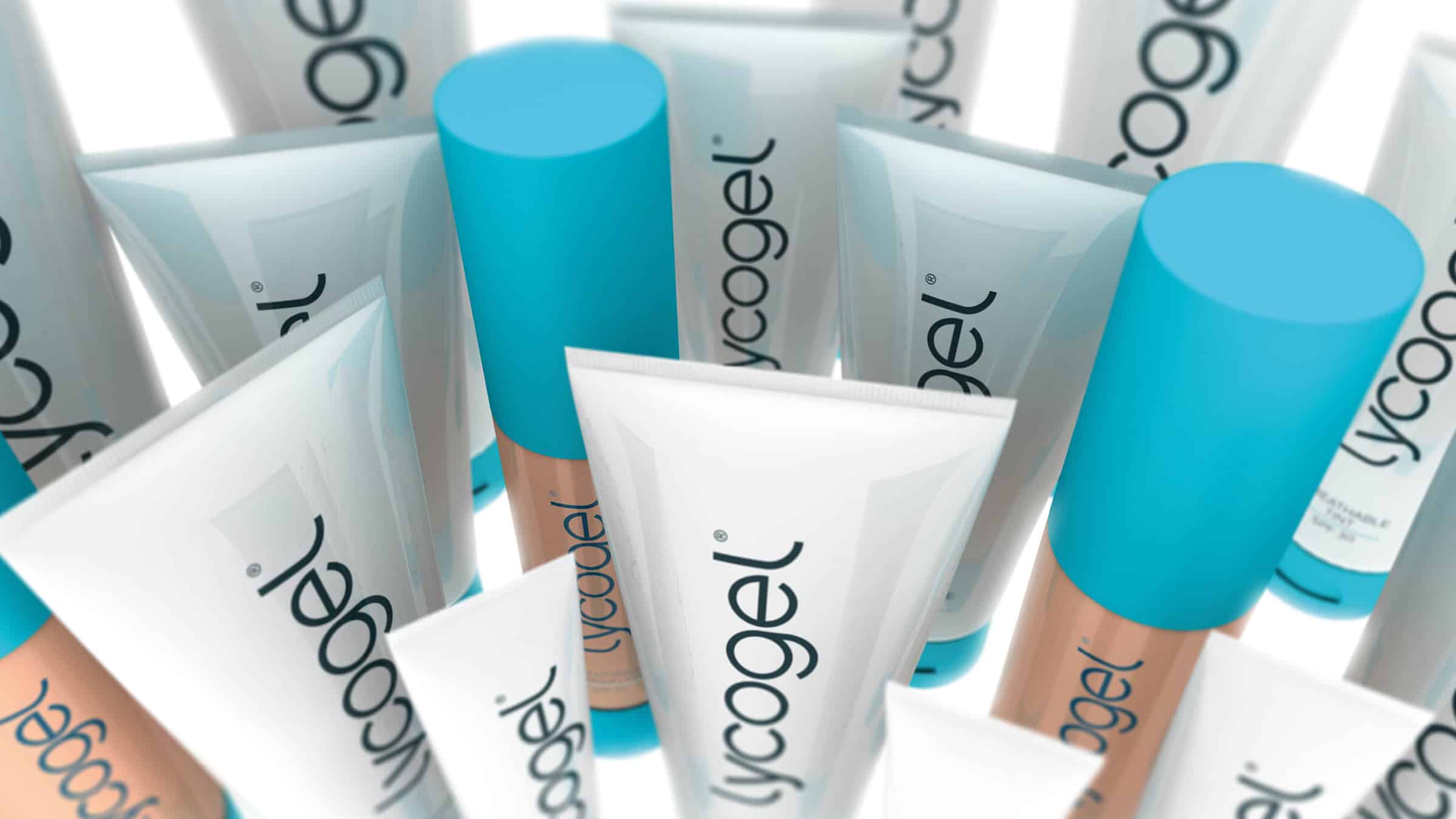
The Lycogel product is about creating a feeling of balance and harmony. We honoured those properties by introducing balanced lines, geometric shapes, and improved contrast. The decision to curve the ‘L’ was not only to bookend the logo with a pleasing shape, but also as a subtle nod to the contours of a face.
A timeless brand identity, with potential to evolve without compromise
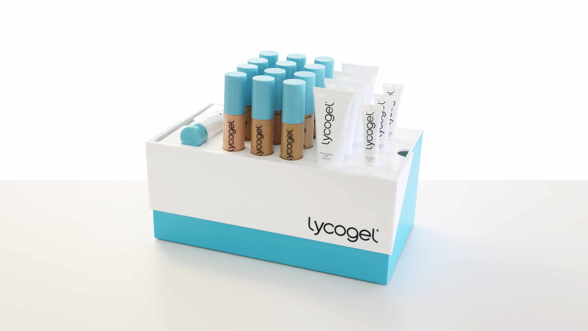
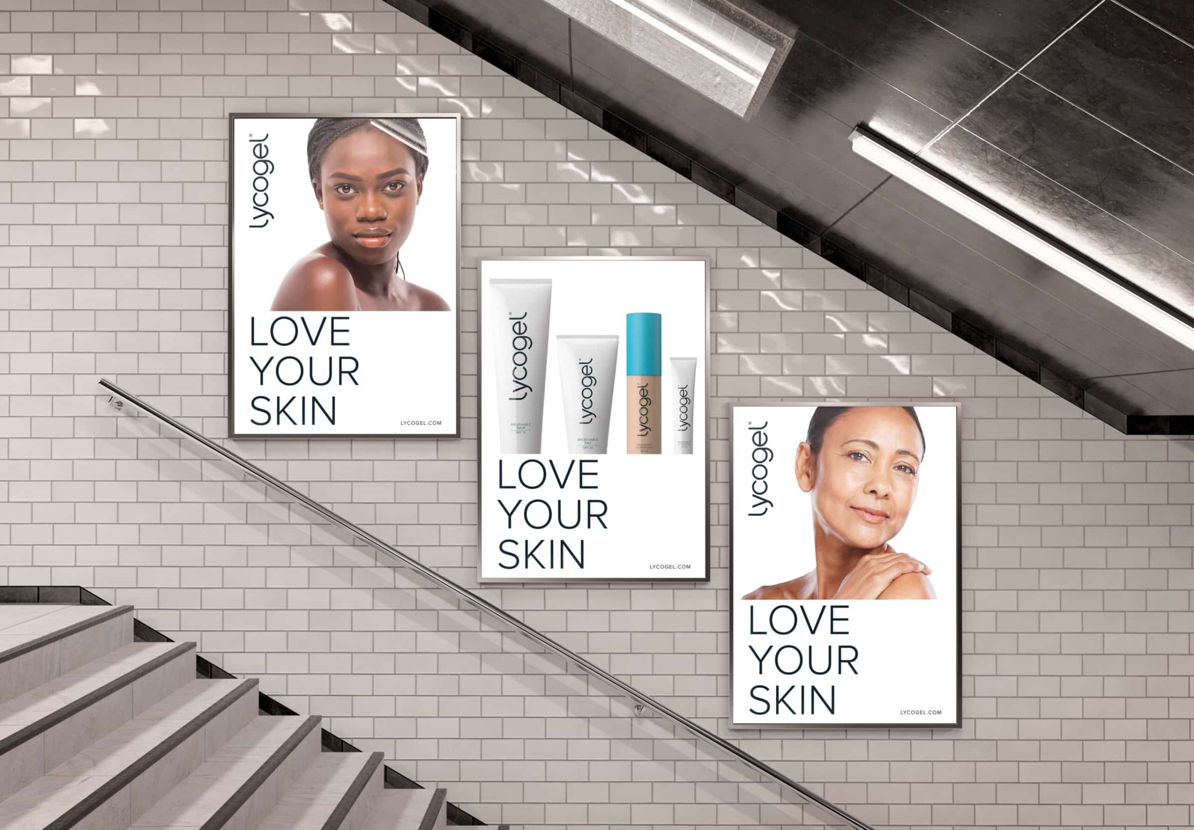
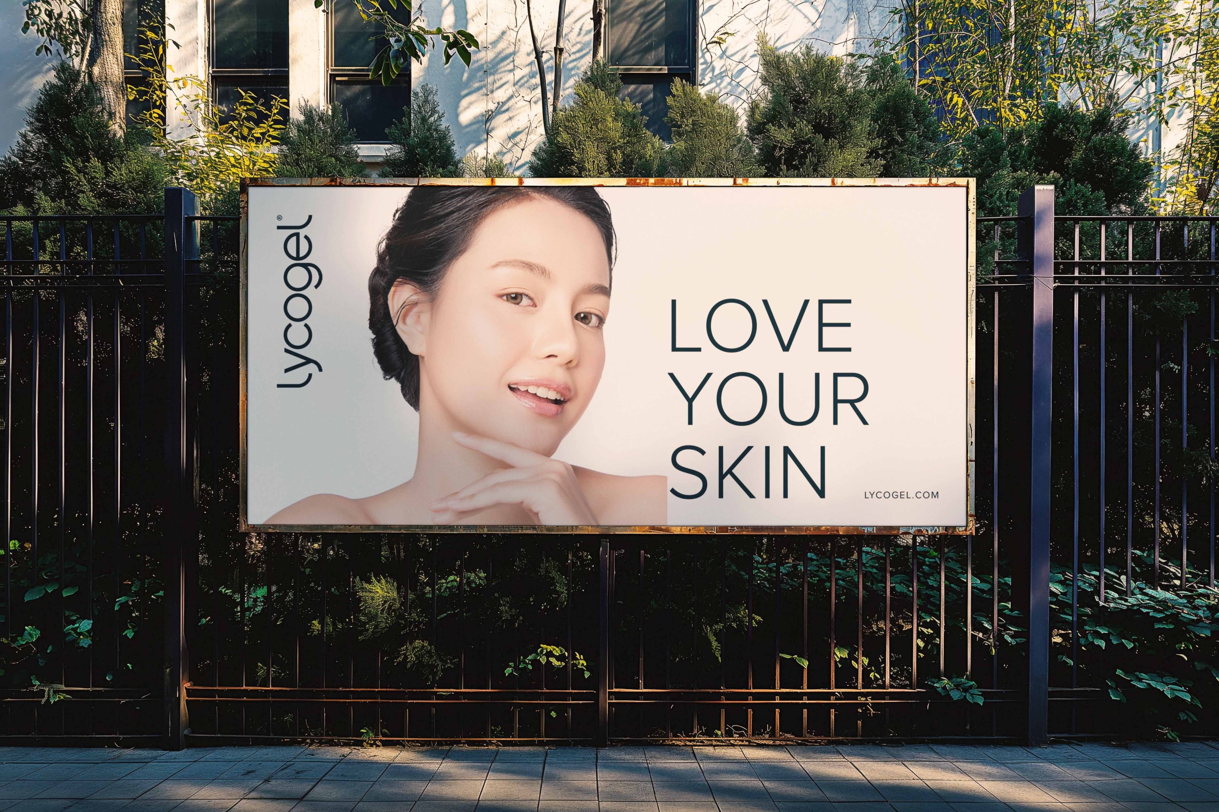
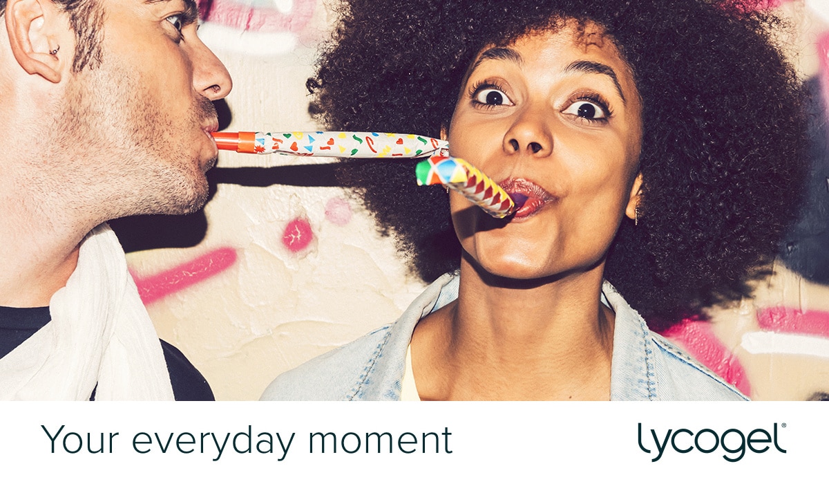
Seven years later, and it’s great to see how the products have evolved; in favour of a contemporary look, without compromising functionality or branding. This inspired us to revisit the ‘everyday moment’ concept, off our own bat, so-to-speak.
Our updated take on the ‘everyday moment’ idea, introduces a contemporary composition, using unconventional crops, favouring bold image and type positioning. We altered the messaging slightly, placing more emphasis on the idea of achieving confidence.

Mirror, mirror on the wall; brand reflection
To conclude, the core, aesthetic elements of Lycogel have aged well, and feels almost as fresh today as it did seven years ago. In terms of the visual identity as a whole, there’s potential for a more contemporary approach to layout and composition. This, combined with reconsidered messaging, could elevate its perception.
Lycogel continue to grow internationally, and we were proud to work with such a successful and quality product. We wouldn’t hesitate to work with the dedicated and friendly team again.
 Abi Suttle
 Mark Banthorpe
“I opened the draft and thought – that is ****** fantastic. I love it. It’s perfect.”
Sandra Blüm, Lycogel