Stokes Sauces
A refreshed brand identity for East Anglia’s favourite condiment.
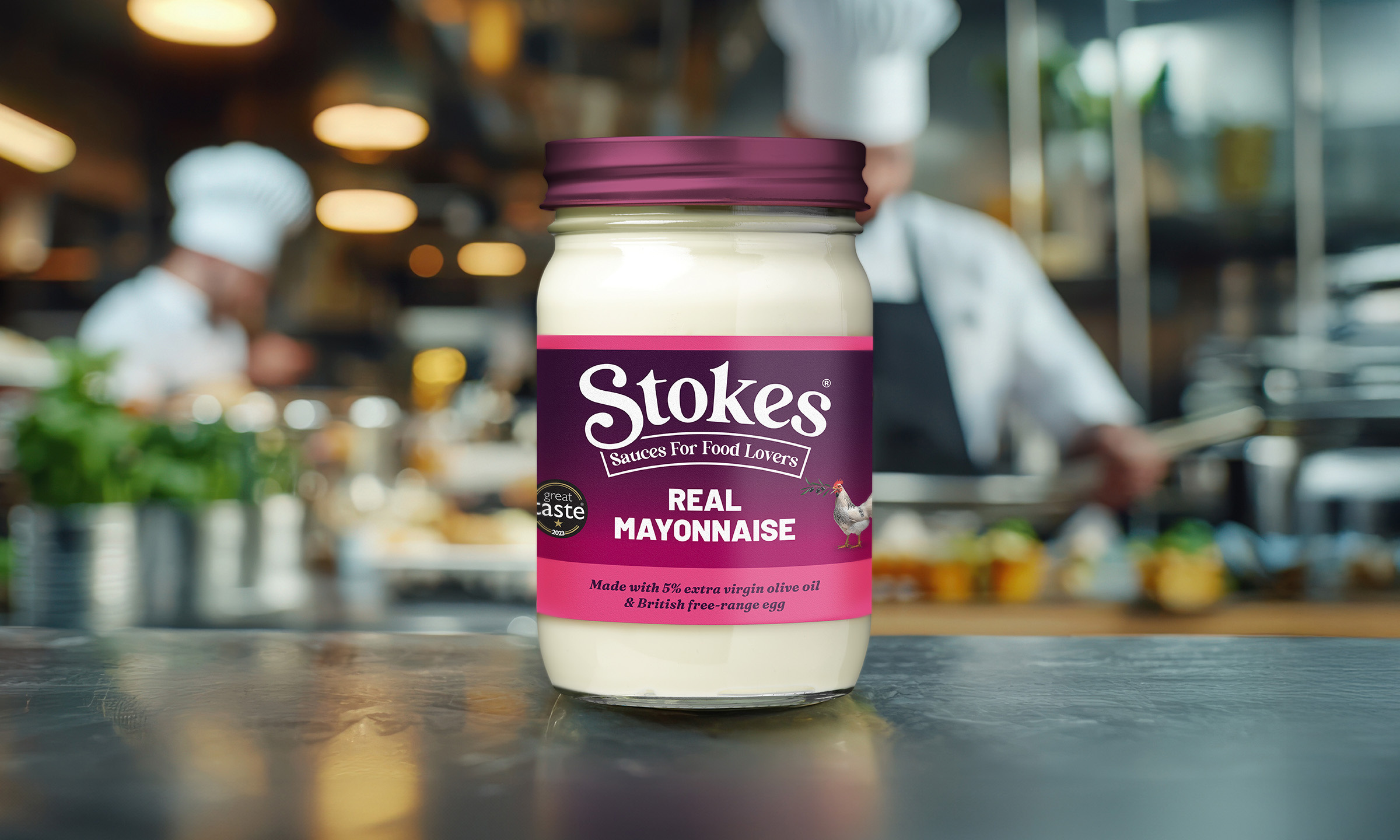
Over the last 12 months, This Is Fever undertook a FMCG brand identity and label design project, partnering with a major food brand to redefine its identity. This brand refresh represents a significant milestone for both the agency and the brand.


Home is where the start is
Starting from humble beginnings making homemade mayonnaise as a way to encourage his children to eat vegetables, Rick Sheepshanks—the founder of Stokes Sauces— soon discovered he was onto something special, and the rest as they say is history. Based in Suffolk, Stokes became a recognised premium condiment brand in East Anglia.

Evolving the logo
Initially wanting a “Mercedes” luxury feel, Stokes’ brand evolved to be more homely, comforting, and joyful. The “Sauces for Food Lovers” strapline was integrated into a friendlier, bolder, and warmer logo with typography reminiscent of 70s/80s cookbooks.
The Stokes logo was redesigned using a blend of three typefaces. The client requested subtle manipulations to the characters in both the logo and strapline to give them a more organic and less uniform appearance.
The previous logo’s sauce drip element was removed. Instead, emphasis was placed on the ‘S’ to subtly suggest a sauce drizzle. The updated logo features a thicker design with softer contrast, aiming to convey a wholesome feel.
The evolution of Lady Britannia (with a helping hand*)
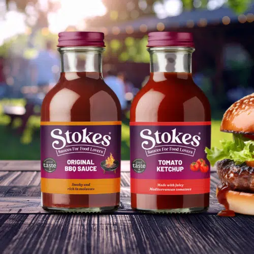
Label designs retained a familiar feel with the same format/colours, but with reduced colour banding and emphasising the gradient as the main background.
Initially considering removing the illustrations, Stokes decided to keep them. AI-generated wood block-print style illustrations were explored, together with a range of styles, but photorealistic imagery was chosen and ultimately used.
This provided a unique look, and offered a more efficient process, by combining stock photos and AI. However, as we know, hands have never been AI’s strong point and so our very own Hannah stepped in to provide some hand-modelling support.

A sustainable rollout
Launching this product in a single transition would present significant logistical challenges. Careful planning is required for production schedules and labelling resources, to ensure there is now unnecessary waste, and loss of earnings. Consequently, expect a gradual rollout of Stokes Sauces in local stores, restaurants, and takeaways over time.


