UX design that drives results
Good UX is invisible. Our designers obsess over how people think, move and decide, so your product feels effortless to use and hard to leave. But great UX does more than feel good. It converts.
Most UX problems are business problems in disguise
When users drop off, lose confidence or abandon a journey, it rarely comes down to aesthetics. It comes down to a product built around internal assumptions rather than actual behaviour. We have seen it across every sector: companies invest in development before they understand the people using it, then spend more fixing what could have been avoided.
We work the other way. Every project starts with a discovery workshop where we bring your stakeholders and our designers into the same room to challenge assumptions and map what we actually know against what we think we know. That session shapes everything that follows: structure, hierarchy, flow, interaction. Nothing moves forward on gut feel.
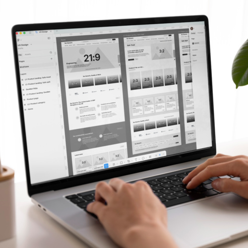
Research shapes the architecture of your product before a single screen is designed. How users think, where they hesitate, what they expect but do not find, all of that informs the structure of your pages, the flow between them and the hierarchy of information on screen. By the time we move to wireframes and prototypes, every decision has a reason behind it.
UI is the surface layer of UX, and it carries more weight than people realise. Visual clarity, contrast, spacing and motion all influence whether a user feels confident or confused. We design interfaces that are visually coherent and behaviourally intuitive, so the aesthetic and the experience reinforce each other rather than compete.
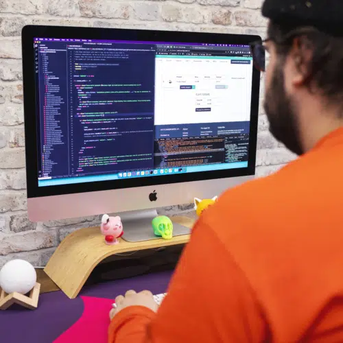
We keep design and development in the same conversation throughout. Interaction states, micro-animations, responsive behaviours and accessibility considerations are built as intended, not approximated. What we design is what your users experience.
Most conversion rate optimisation work treats the symptom, not the cause. Tweaking button colours and headline copy can move metrics marginally, but it rarely addresses why people hesitate in the first place. Sustainable conversion improvement comes from fixing the underlying experience: reducing cognitive load, building trust at the right moments and removing friction before the decision point.
That is a UX argument. And it is why we approach CRO as an experience problem, not a testing problem. When a user abandons a checkout, fails to complete a form or leaves a pricing page without acting, something in the journey created doubt. Our job is to find it, understand it and design it out.
People do not make rational decisions online. They scan rather than read, rely on visual cues to judge credibility and make judgements about trust within seconds of landing on a page. Anxiety spikes at commitment points: forms, checkouts, sign-ups. Confusion at any of these moments does not just cost a conversion, it damages confidence in your brand.
Understanding the psychology behind those hesitation points is what separates UX that looks good from UX that performs. We design with that behaviour in mind, using hierarchy, copy, layout and interaction to reduce doubt and increase confidence at every stage of the journey.


Let’s talk.
Ready to discuss your UX design needs?
Complete the contact form and our team will get back to you within one working day. Whether you’re looking to start a new website design project or have questions about how we work, we’re here to help. From our principle studio in Colchester and our remote office in London, we partner with businesses across the UK and beyond.