Frantec
Providing clarity when it matters most.
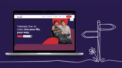
Implementing Frantec’s new brand across their website and making it simple for anyone, often under real pressure, to understand the care available and get in touch.

The context
Frantec cares for people with complex, individual needs and widely varying levels of dependency. No two care plans look the same, and that is the strength of the service. The difficulty was showing it. Following a rebrand, Frantec needed a website that carried the new identity and made the tailored nature of its care clear to the people deciding who to trust.
Most people arrive on Frantec’s site at a difficult moment, often after a sudden change in someone’s health, and they need an answer quickly. They aren’t comparing brochures. They want to know whether Frantec can help, what care will involve, what it will cost and how to start.


The Strategy
Our approach had two parts. First, a user journey built around speed and clarity so anyone could find the right information and get in touch without having to work anything out. Second, a visual language that could represent individual care without reducing it to one type of person or need.
We started with the journey. The structure was kept simple and the routes to contact made obvious, because a confused visitor at a stressful moment is a visitor who leaves.
We introduced an illustration style that feels personal without defining who Frantec’s care is for. Photography of real people tends to let one face stand in for everyone. Illustration gave us warmth and individuality while leaving room for the full range of needs Frantec supports.
The site applies the new brand consistently, so the identity Frantec invested in is the first thing people experience.


“Honestly, you guys have been amazing! Thank you so very much, you delivered a fantastic piece of work.”
Shona Lingham, Commercial, Digital & Office Manager

