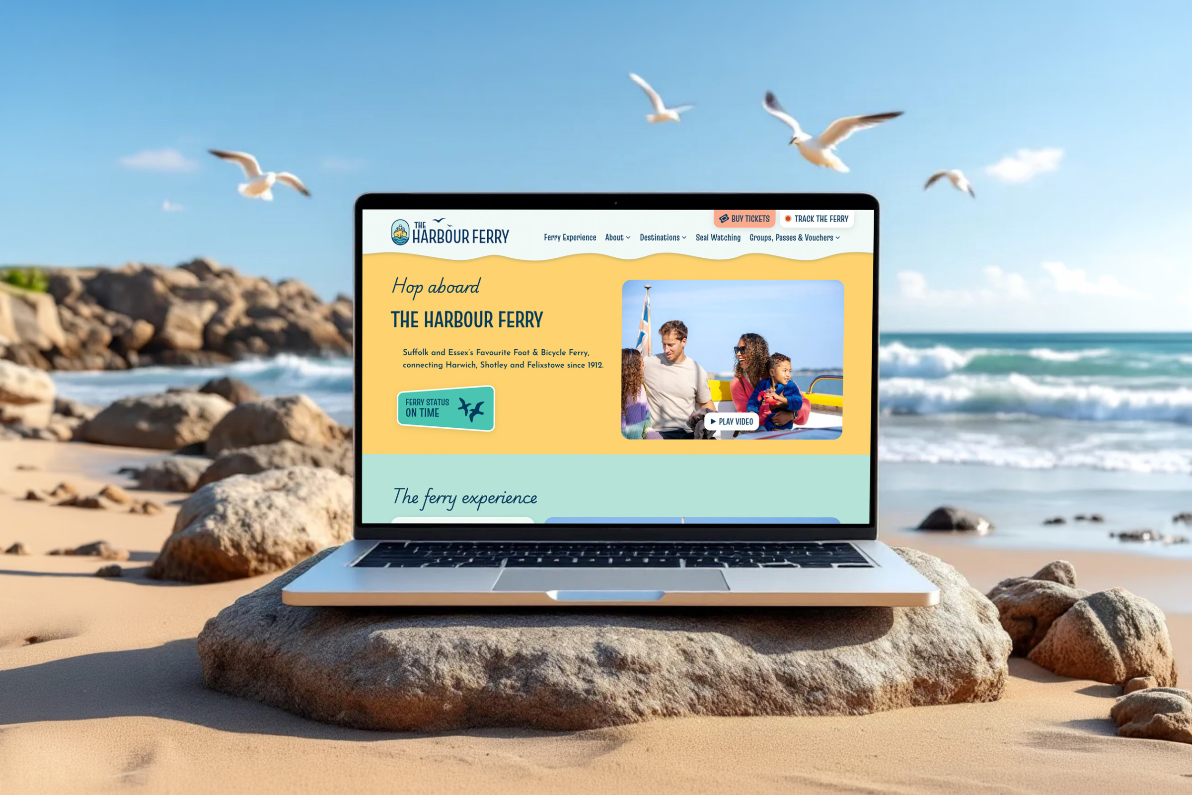
The Harbour Ferry
Website design and brand identity overhaul.
A new brand identity and website for The Harbour Ferry, repositioning a well-kept local secret as a proper day out for families, tourists and day-trippers across Essex and Suffolk.

The commercial challenge
The Harbour Ferry runs a foot service between Felixstowe, Harwich and Shotley, three destinations with real stories to tell. But the business had a visibility problem. Fewer than 1% of people in Colchester knew the service existed, and for those who did find it online, the experience didn’t match the one on the water. The site was dated, awkward to navigate, and framed the ferry as pure transport, a crossing to endure rather than a day out to enjoy. The booking flow was clunky. The brand lacked the warmth and character needed to draw in families, day-trippers and the curious.
We were asked to reposition the ferry as an attraction in its own right, not just a way to cross the water. That meant a brand identity with personality, a website built around the visitor experience, and a booking system that felt effortless. Commercially, the goal was to grow ticketed trips from a wider audience: families, tourists, and the surrounding towns who hadn’t yet discovered the route.

Analysis and insight
We started by auditing the existing site, booking flow and brand touchpoints, then sat down with the team to understand the commercial reality. Two things stood out.
First, the current site failed to communicate the experience, the scenery, the heritage, the character of a locally run service. Second, the Planyo booking system had to stay for budget reasons. That set a clear constraint from the outset: we were designing around a third-party tool, not replacing one.
We also looked across comparable attractions and heritage routes in the region. The pattern was consistent — operators either leaned too hard into “kid-friendly” with bright primaries and cartoon mascots, or too far into coastal earthiness with faded palettes and sepia tones. Neither matched what the client wanted, or what The Harbour Ferry actually is.

The strategy
Based on the evidence, our approach was threefold: build a brand that sits between illustrative and graphical, bold and characterful without tipping into Fisher-Price; structure the site around the three destinations, so each has space to tell its own story; and engineer the Planyo integration to feel like a native part of the new experience, even where the platform pushed back.
The client came to us with a clear vision, and we worked alongside them to refine and realise it. The result is a visual language that sits deliberately between illustration and flat graphic — confident shapes, considered detail, and a palette anchored in warm yellows and teal-to-sea-green tones. The colours carry heritage and coastline without tipping into nostalgia or novelty. Typography and motifs were chosen to feel rooted in place, so the identity reads as local rather than generic.
The homepage is built around three equal entry points, one for each destination. Felixstowe, Harwich and Shotley each get their own dedicated space with local information, things to do nearby, and practical travel detail. A history section, including a visual timeline, gives the ferry’s heritage the weight it deserves. FAQs, timetables and vouchers live where users expect to find them, not buried in the footer.
Planyo was the commercial choice — cost-effective, fit for purpose, but built around its own UI patterns. Making it feel like a natural part of our new design, rather than a bolted-on third-party widget, took real work. We handled the visual layer with care, applied the refreshed brand wherever the platform allowed it, and built clear confirmation prompts into the journey so visitors review their booking before committing.
Where Planyo limited what we could do, we were transparent with the client about the trade-offs. The savings against a bespoke build were material, and we agreed together where to compromise and where to push. It wasn’t always an easy path, but it was the right commercial call.


