AReye
Guiding the way to greater independence.
This is Fever have worked with the University of Essex Students Union on over 120 projects, in a partnership that we’re hugely proud of.


Overview
It was through this relationship that we were invited to pitch our Web and Graphic Design services for the University’s Research & Enterprise Office for a new invention that they had developed, AReye.
This was a very exciting project, as a team at The University of Essex had developed a product that has the potential to revolutionise the lives of people living with Visual Field Loss, which is a specific type of blindness.
What is AReye?
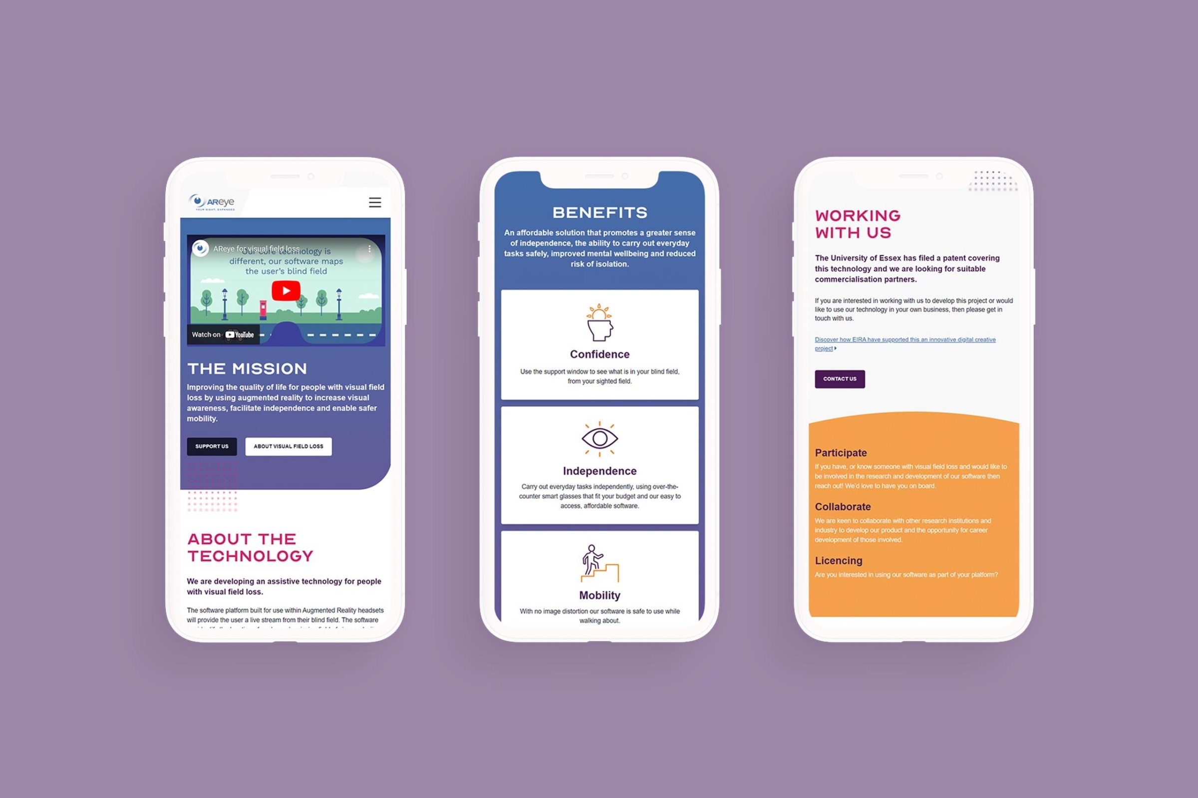
AReye is a software solution for people living with Visual Field Loss and is designed to work with all types of virtual reality (VR) headsets. The technology works by providing a live stream that compensates for the specific area/s of blindness that a user has.
This allowed them to be more aware of their surroundings, giving them the confidence to navigate their environment more safely. We were briefed to create a new website, logo, and short animated video to showcase AReye to potential supporters and backers.
Our first task was to help create a strong identity for AReye, a logo which encapsulates what they do. Following a detailed research phase, we presented the client with three initial concepts.


The final version
Once a review of the concepts had been conducted by the client, you can see how certain elements from each were taken and incorporated into the final version.
We have used two fonts (Optician Sans & Fieldwork font) to enable the distinction between AR (which needs to be used as uppercase) and eye (too allow for lowercase script).
Following a further round of refinements, the logo was approved, allowing us to progress with the website.
Developing the website
In order for AReye to be promoted for funding and research support, the team needed a website that showcased the technology in a clear and concise way.
As a result, we needed to incorporate details of the product, the team behind the research and development, and an animated video to showcase what it is like to experience Visual Field Loss.
By showcasing these elements, we were able to clearly demonstrate the solution that AReye provides. Having developed the logo and underlying branding, we aimed to incorporate much of this styling into the new site. This was really fun to do, as we have included Optisian Sans as the primary font, along with patterns that simulate vision loss by incorporating blurring.


Animation
They say that an image paints a thousand words, if this is true, a video must paint a thousand pictures. This is definitely the case when it comes to showcasing what people living with visual field loss experienceon a daily basis. Part of our work with the team at AReye, was to create a two minute video, that clearly demonstrates what their software solution sets out to achieve. It’s when seeing, first-hand, the life changing impact of AReye.
For the animation, we began by developing a storyboard. The purpose of this is to show the specific timings for each of the individual elements that will be included, along with images to show central design themes and key features. Following the initial storyboard, there are often several amendment and feedback rounds that once agreed, will form the blueprint for the final video.


