IntoZetta are a data consultancy service. Working across many industry sectors, they deliver data projects that help companies harness their data and use it to improve their processes.
Overview
IntoZetta approached us with two projects, the creation of new icons and illustrations and a complete redesign of their website. This project came at a time of big upgrades of many of IntoZetta’s systems.
After consideration, IntoZetta decided they wanted to switch their site over to WordPress for the flexibility and reliability that it offers. The new website needed to be page speed optimised, accessible to WCAG 2.1 standards and SEO compliant.
Firm foundations
We created wireframes of each page of the site. A wireframe is a greyscale blueprint of a webpage, it indicates where each element will go on the page and is used to ensure that the user experience is optimal before any design flourishes are in place.
Adding personality
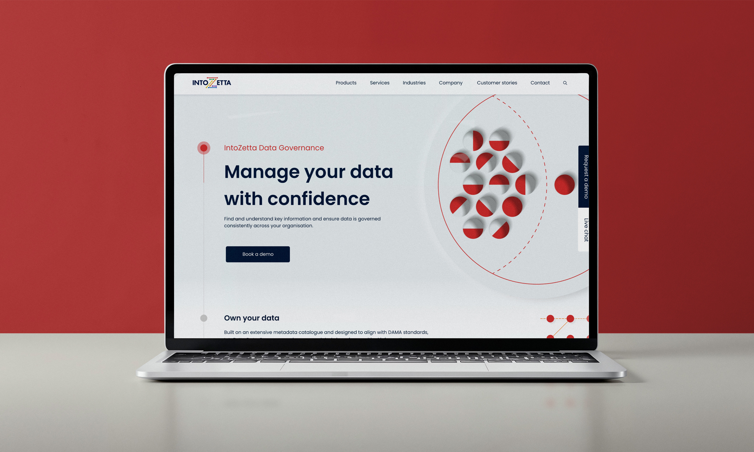
Once the wireframes were complete and signed off, we started to explore colour. We used colour to differentiate between the services that IntoZetta offer, each colour corresponds to a product, giving each page a unique identity.
We wanted the website to echo IntoZetta’s user-friendly approach and so we designed this site with a clear, minimal look and feel. By using cards to display the services, they are laid out clearly with a professional feel. The icons enable us to signpost each section without having to rely on big blocks of colour.
How we worked
We worked with Thomond, IntoZetta’s marketing consultants on this project. Having delivered projects with Thomond before, we were excited to collaborate with them on this project. We have lots of experience working with third parties and the project certainly benefited from the wealth of experience provided by our combined teams.
The visuals
Presenting IntoZetta’s services in a highly visual way was important. We used animation throughout the site to create a dynamic feel.
The Proof of Concept process is outlined using a slider to take the user through the 8 steps.
An eye-catching animated “Z” on the homepage displays the six colours that signify IntoZetta’s different products.
To advertise IntoZetta’s software, we built hotspots signposting to key features of the software that the user can hover over to learn more.
Credits
Senior Developer
Jordi Hales
Head of Design
Mark Banthorpe
“We wanted to provide our visitors with an easier way to learn all about the products and services that we offer here at IntoZetta. A huge thank you to This is Fever and Thomond for turning that vision into reality.”
We’d love to discuss how we would be able to lend our expertise to your next project. Get in touch for an informal chat about how we can make this a reality.