Phelan
Brand identity refurbishment.
Phelan is a leading fast-track contractor operating in Essex, London and the UK.

Out with the old, in with the new…ish
Phelan’s branding hadn’t changed much since its inception in 1987, and our brand workshop revealed that they wanted more of an evolution, not a revolution, for their image. It was made clear that the logo itself couldn’t be tampered with too much through fear of disrupting their brand’s reputation.
Consistency was something we needed to bring to the table, as there were already three different versions of the logo being used across comms at the time. With these points in mind, we made subtle changes to bring the logo more up-to-date, while maintaining its classic look.

A subtle transition
With most of the look and feel of the brand identity established from the outset, we set about creating a set of brand guides, and with these, the brand evolved over the course of a few months.
We did this through various deliverables for other campaigns, highlighting Phelan’s ambition as an industry leader by focusing on subjects such as ‘Women in Construction’ and ‘Phelan Fine’ — an initiative for better mental health awareness.


Phelan Homes
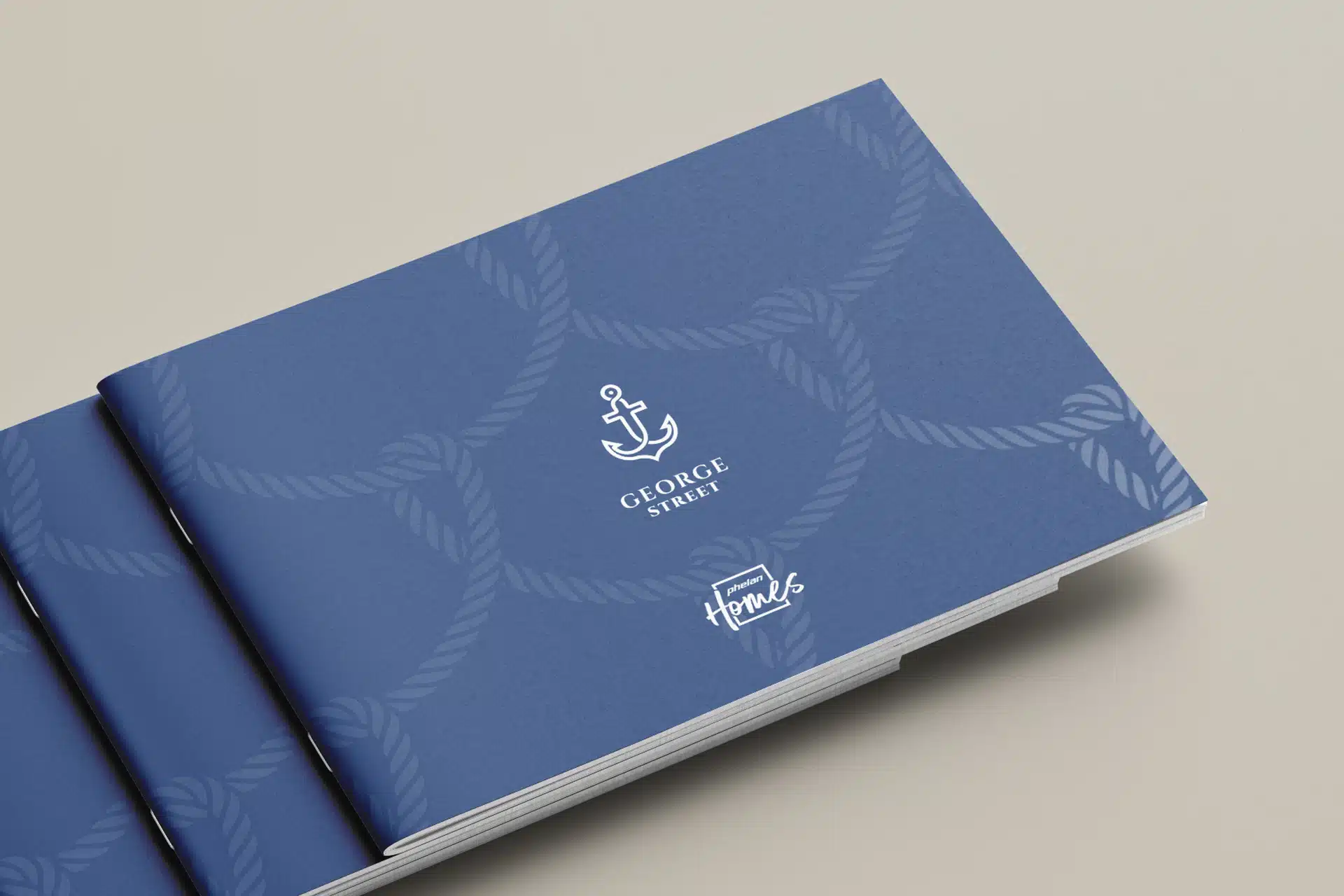
Phelan Homes was set up as an independent company venturing into property development., We created the logo based on the Phelan branding, but with more attention to the end-user, using typography to convey a relaxed yet aspirational look. Their first acquisition into property development was for George Street. A collection of three-bedroom townhouses, situated close to the Harwich coastline.
We created the George Street logo in tandem with the Phelan Homes logo, followed by a property brochure showcasing the George Street homes, where we created illustrated floor plans from the original diagrams.


Visualising ambition
The Phelan website represented the last major asset to be given a make-over in their branding update. A relatively simple brochure-style website was needed to showcase their projects and to relay the latest industry news internally and externally.
Their previous system made it virtually impossible for Phelan to control and update their own website content, so it soon became inefficient and horribly dated. Therefore it was important for the team managing the website at Phelan to reflow migration to a more reliable, sustainable and easy-to-use system.


