UK Data Service
2021
Research
2021
Research
Producing a visual language for the largest digital repository for social science and humanities data in the UK.
The team at UKDS are committed to providing high-quality social and economic data, to do this they needed to instil clarity and consistency across their marketing activities. Having worked with us on a number of projects including the creation of their annual report and a series of infographics, we worked with them to create a brand guide to deliver consistency across the organisation’s marketing collateral.
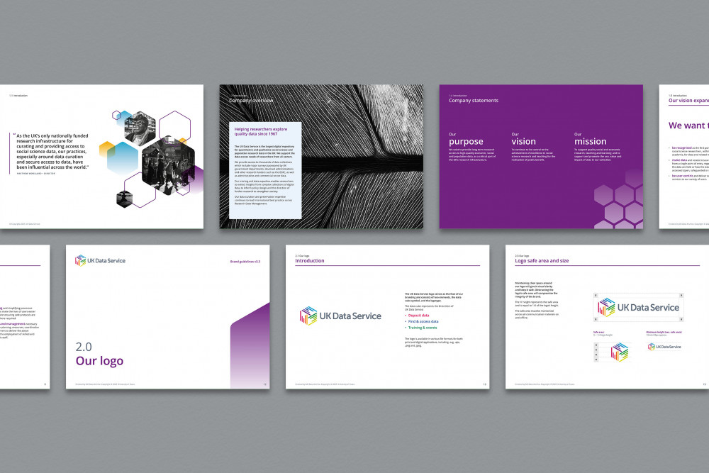
- Brand guidelines
- Annual report
- Infographic
- Illustration
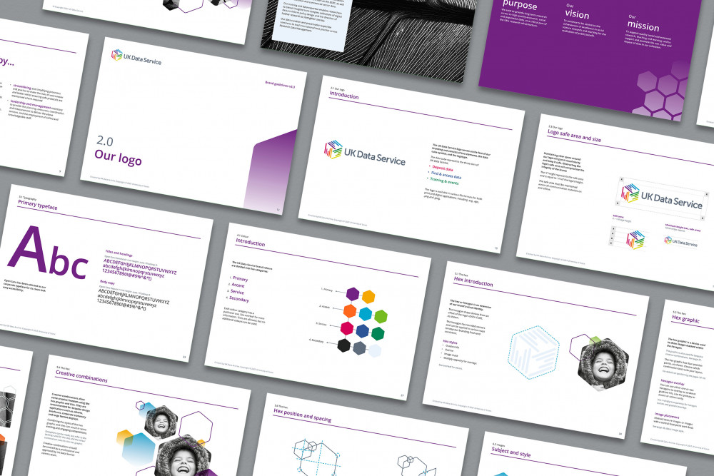
What is a brand guide?
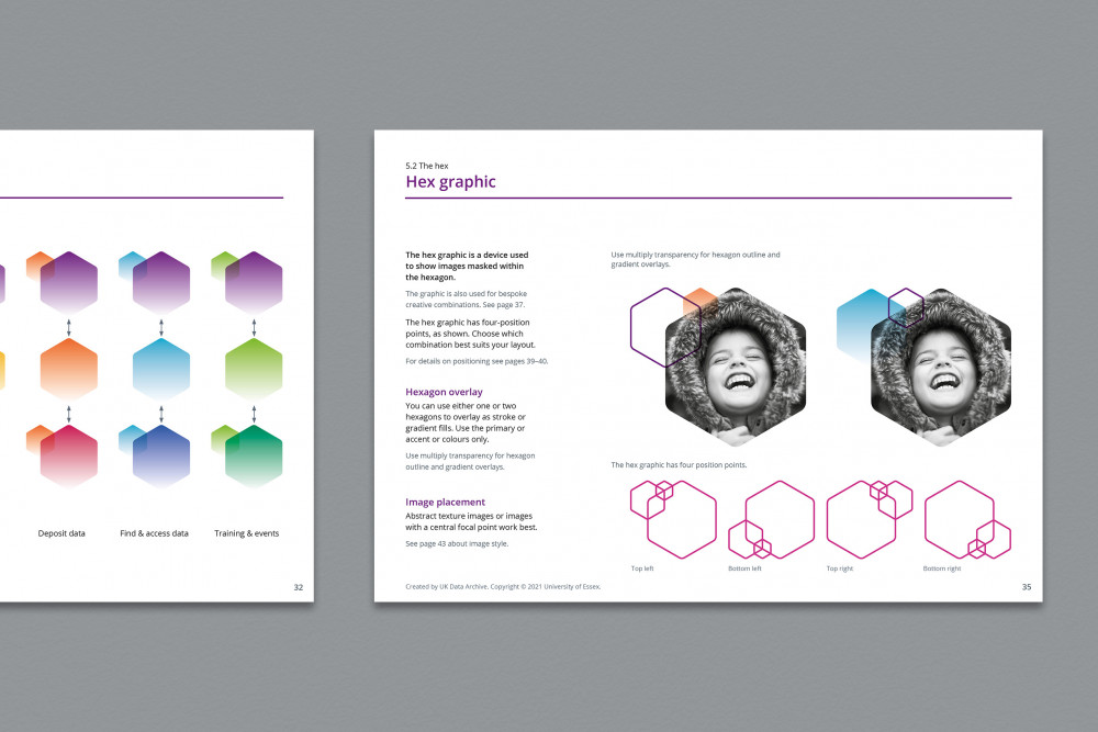
A simple brand guide typically details what colours are used, primary and secondary fonts and typefaces, logo positioning (and any logo variations), along with anything else that is important in helping to create brand recognition and strengthen the overall brand identity.
However, it’s not uncommon for brand guides to be very complex and to cover a host of different things. For UKDS, it was crucial that their brand could be conveniently applied to data visualisation and so the brand guide contained guidance and considerations for Microsoft Word documents and Excel spreadsheets to ensure that data was consistently presented across the organisation. Additionally, because UKDS frequently collaborate with other institutions, the brand guide laid out advice for logo placement for additional logos.
The purpose of a brand guide
A well-developed brand guide is one of the most important documents that a company should have, as this sets a clear set of rules that should help communicate a consistent message to your target audience.
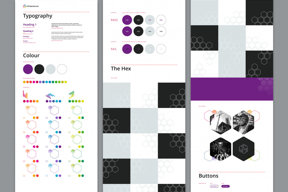
Brand accessibility
One of the most important elements of the brief was to create a coherent guide for accessibility, from basic colour contrasts and font sizing to more complex setups. Having a great deal of experience in creating accessible websites and documents, this is always a core feature for all of our design work, however, due to the need for a comprehensive accessibility guide, we conducted a deep dive into how screen readers work, and set up Microsoft Word and Powerpoint templates for internal use. This also included setting up the correct colours and styles to use for various data visualisation tools used within MS Office.
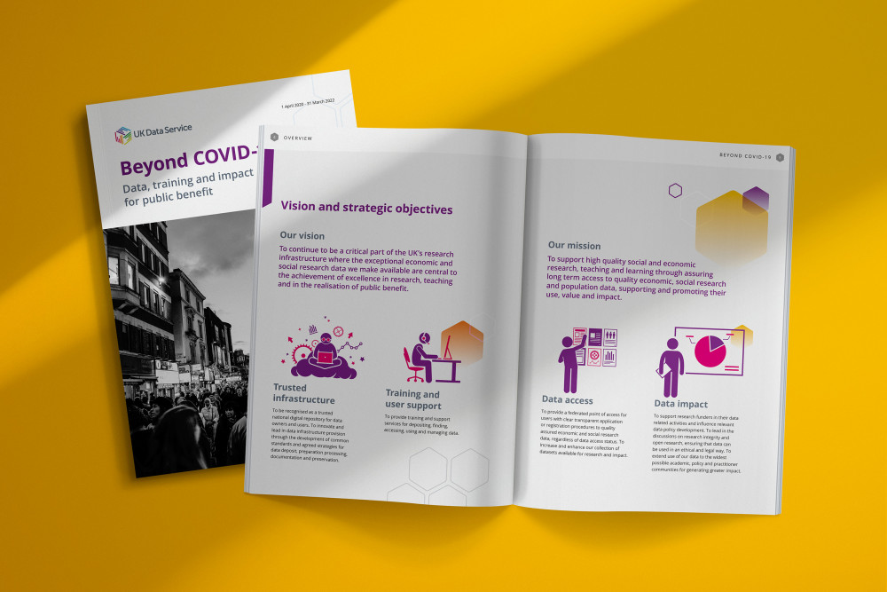
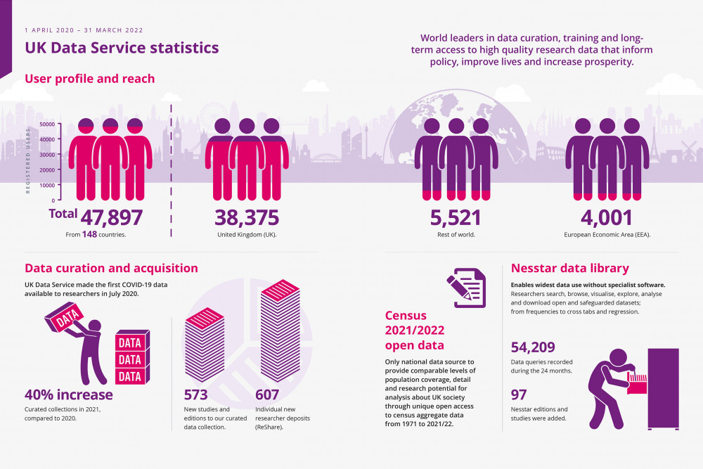
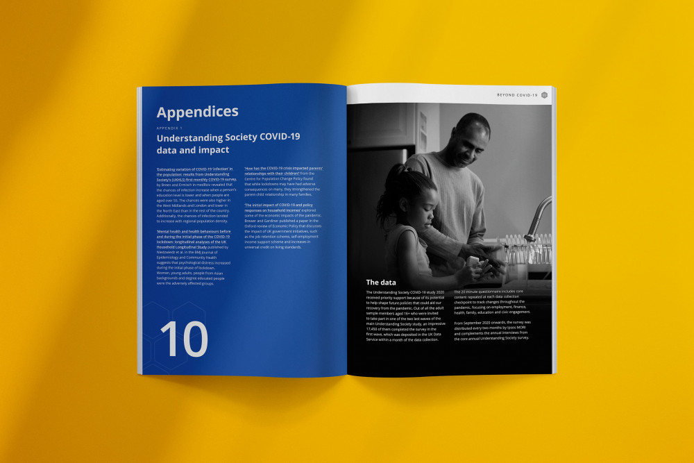
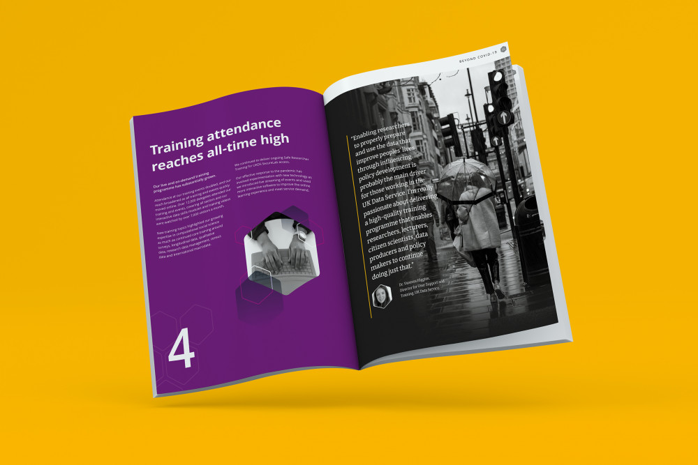
Bringing together two years of data
Titled ‘Beyond Covid-19’, the annual report covers the extraordinary two-year period between April 2020 and March 2022. Working with the UK Data Service (UKDS), we designed a report to highlight the exceptional work and impact UKDS made throughout the pandemic and demonstrate the significant rise in service use throughout that period.
Expanding on the newly refreshed branding, we created the report to showcase statistics and stories, representing social and economic lifestyles. We used a combination of custom-made graphics, stock images, contrasting colours and digestible typography. Not only was the report printed, we were tasked to create a digital PDF version which adheres to strict accessibility guidelines, allowing screen readers to easily read the 78-page document.
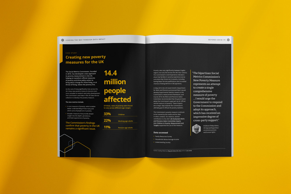
Creating infographics to engage the reader
We produced infographics to convey a large volume of data in a digestible and engaging format. Using our golden rule of form follows function, the infographics translated complex data into a visual language that was consistent with our client’s brand identity.